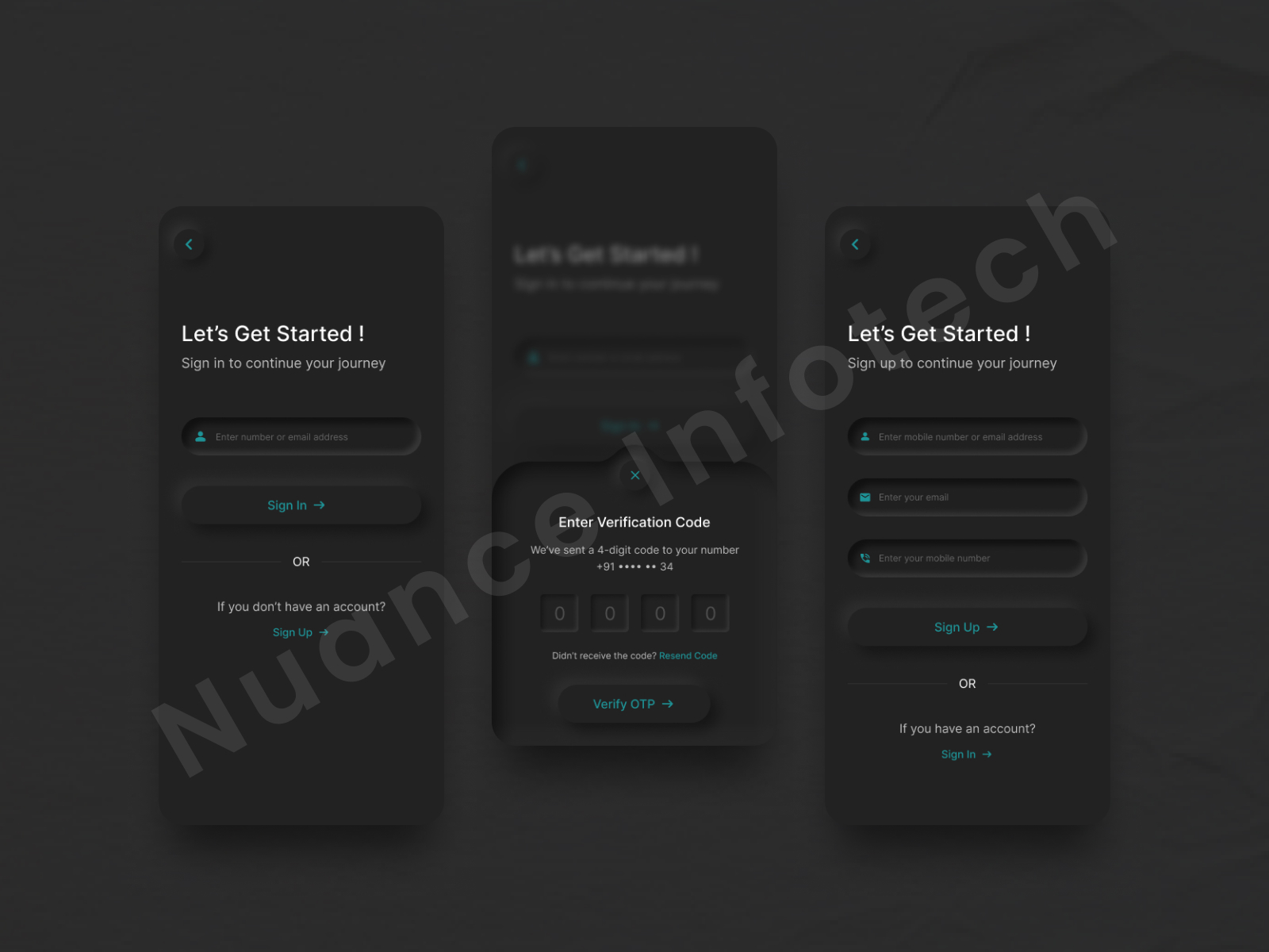
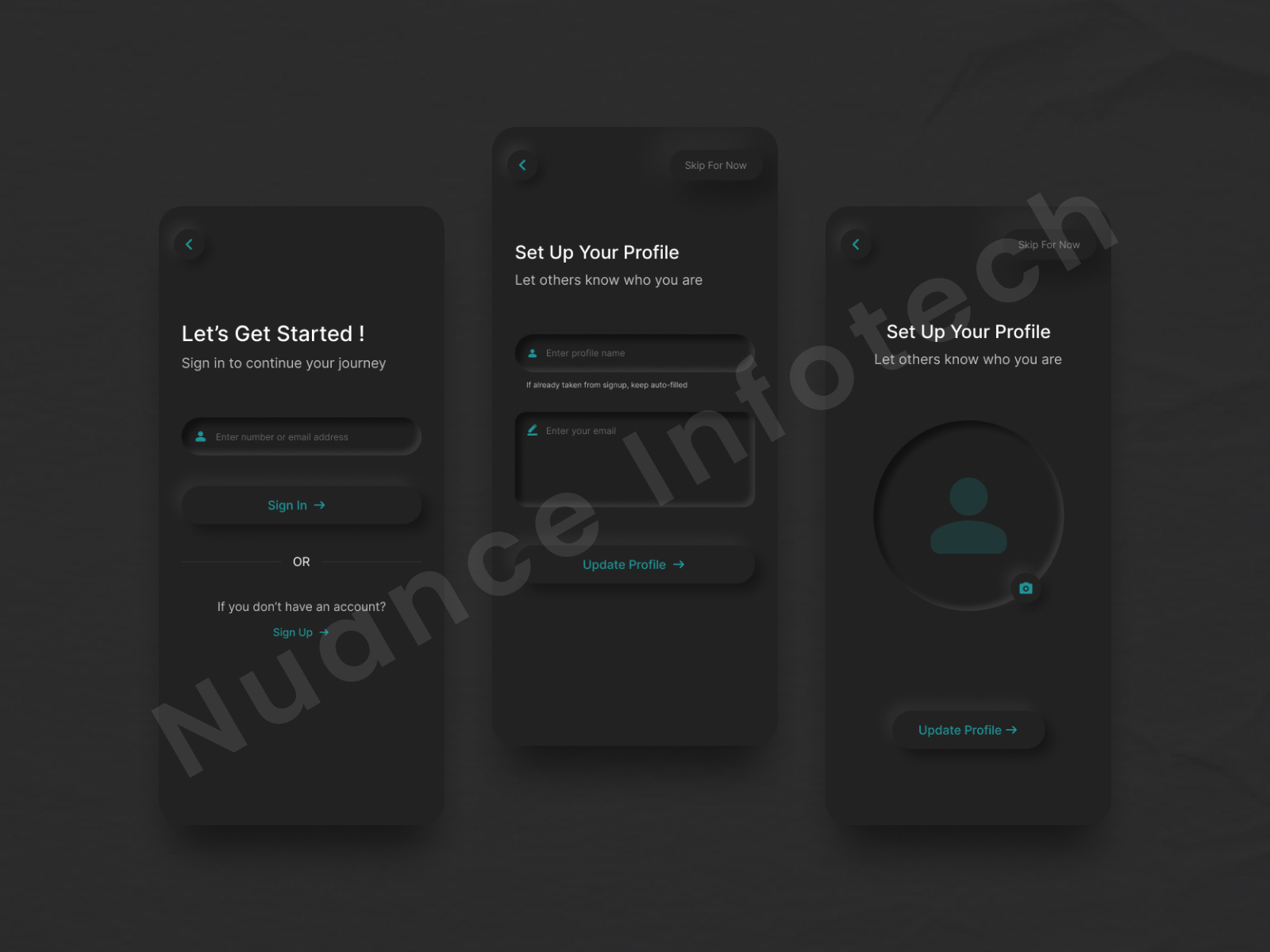
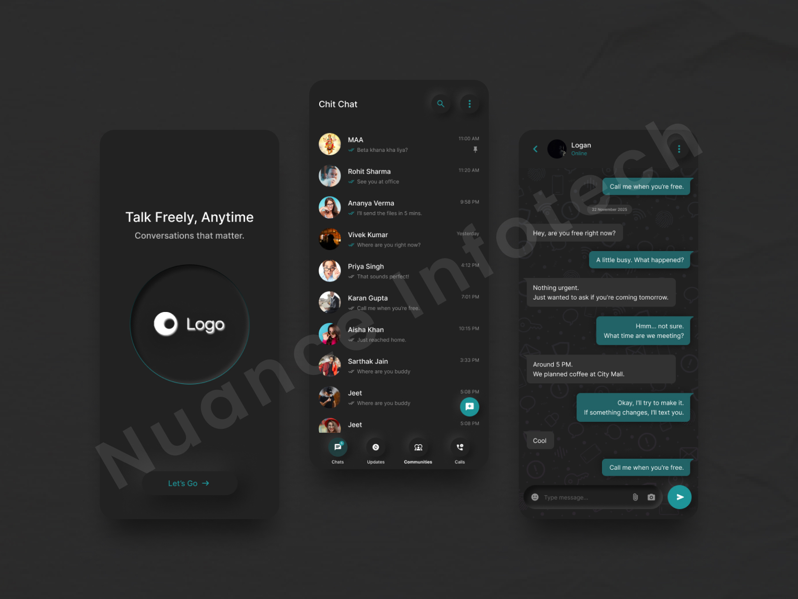
The client wanted a modern dark-mode messaging app UI that feels distraction-free and fast—clean onboarding/welcome, a scannable chat list, and a comfortable conversation screen with clear message hierarchy, timestamps, and action patterns.
Get a 48-hour UI Audit for your app UX
We’ll share a 10-point checklist + quick wins for navigation, readability, interaction patterns, and engagement improvements.
We designed a messaging app UI/UX focused on speed, clarity, and comfort—creating a clean dark-mode experience that keeps conversations easy to follow. The flow includes a welcome screen, an organized chat list with strong readability, and a conversation view built around message hierarchy, spacing, and minimal UI noise. Subtle interactions, clean icons, and balanced typography improve scanability while preserving a friendly tone. Built mobile-first with reusable components, the UI can scale to features like search, media sharing, voice notes, and message status states.
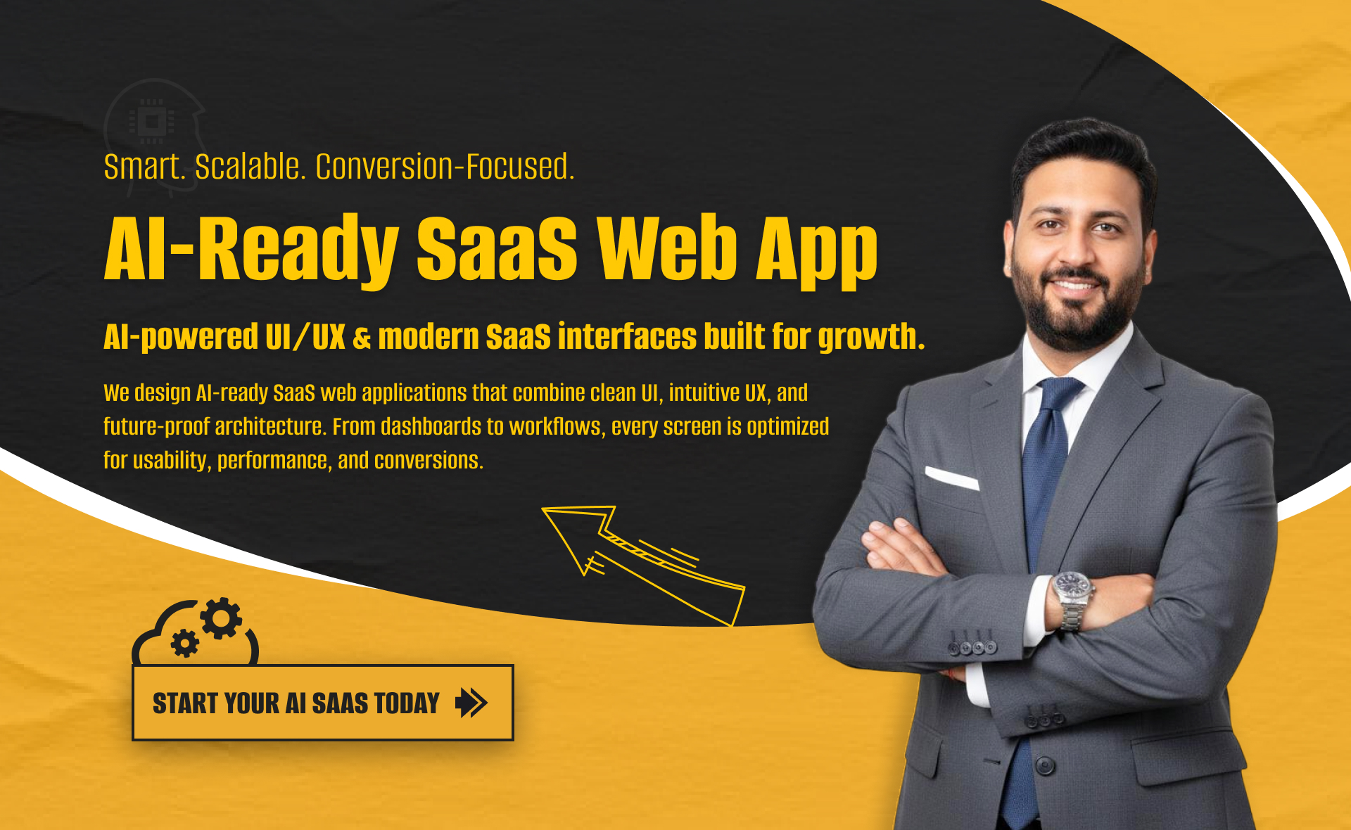
I will build an AI-ready, fast, modern, and scalable saas web app using React and NextJS
I will develop website with react next vue nuxt js tailwind CSS

I will design intuitive UI UX for dashboards crms web apps admin panels