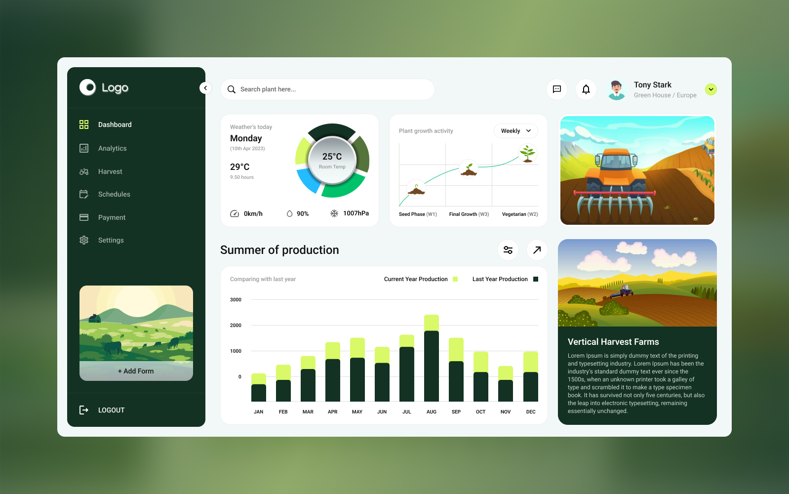
The client wanted a smart agriculture admin dashboard that helps teams monitor farm operations in one place—track crop performance, view key metrics, and manage activities efficiently through a clean, data-first UI that stays usable even with complex information.
Get a 48-hour UI Audit for your dashboard UX
We’ll share a 10-point checklist + quick wins for KPI hierarchy, charts/tables usability, navigation, and action clarity.
We designed an agriculture admin dashboard UI/UX focused on clarity and fast decision-making—helping teams monitor crops, track farm data, and manage operations efficiently from a single dashboard. The layout uses a clean information hierarchy with scannable KPIs, readable charts, and structured tables so users can spot issues quickly and take action without digging through clutter. The design is responsive and component-driven, making it easy to scale across farms, seasons, and additional modules over time.
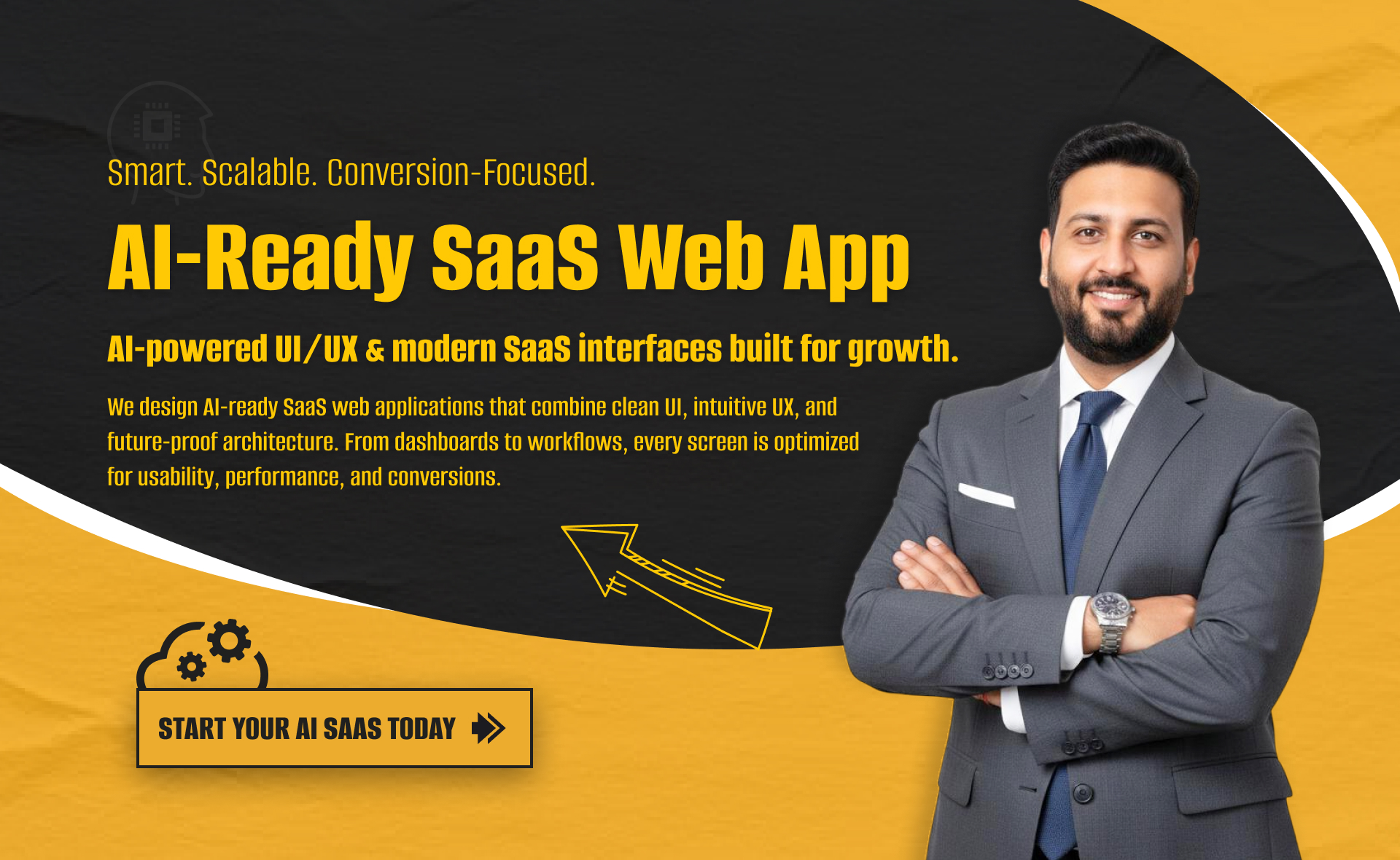
I will build an AI-ready, fast, modern, and scalable saas web app using React and NextJS
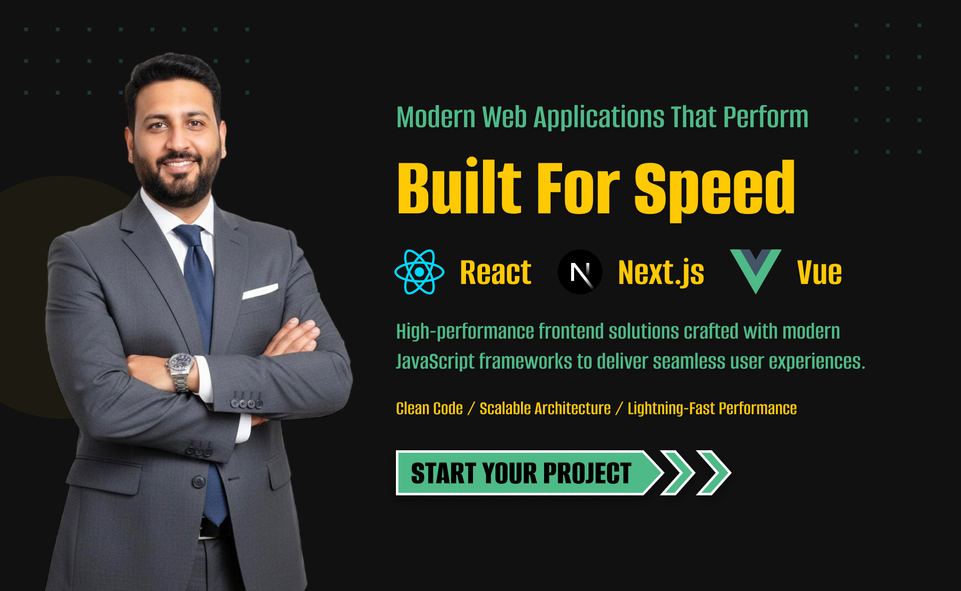
I will develop website with react next vue nuxt js tailwind CSS

I will design intuitive UI UX for dashboards crms web apps admin panels