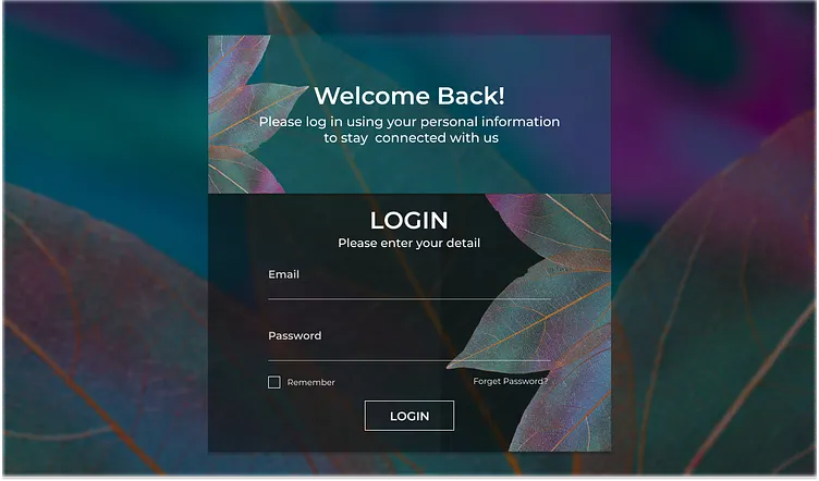
The client wanted a clean, user-friendly login page that feels effortless and trustworthy—simple form hierarchy, clear guidance, and a mobile-first layout that reduces sign-in drop-offs.
Get a 48-hour UI Audit for your login flow
We’ll share a 10-point checklist + quick wins for login UX, validation, recovery flows, and drop-off reduction
We designed a clean login page UI/UX focused on clarity and completion—helping users sign in quickly without confusion. The layout uses strong visual hierarchy, readable spacing, and consistent input states to make the form easy to scan and complete on mobile. We also applied best practices like inline validation, clear error messaging, and well-placed “forgot password” recovery patterns to reduce frustration. The result is a smooth, user-friendly sign-in experience that supports higher completion rates and a more confident first interaction.
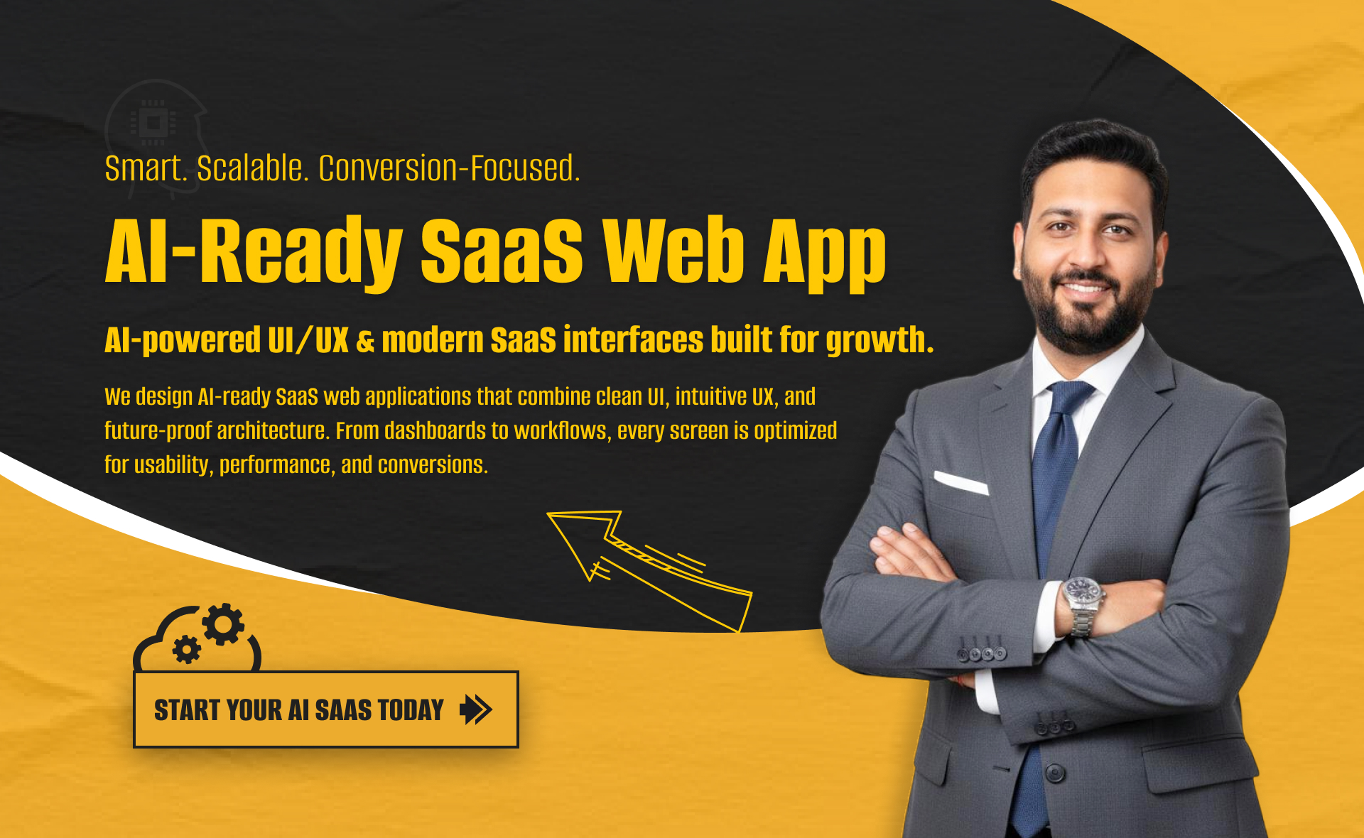
I will build an AI-ready, fast, modern, and scalable saas web app using React and NextJS

I will develop website with react next vue nuxt js tailwind CSS

I will design intuitive UI UX for dashboards crms web apps admin panels