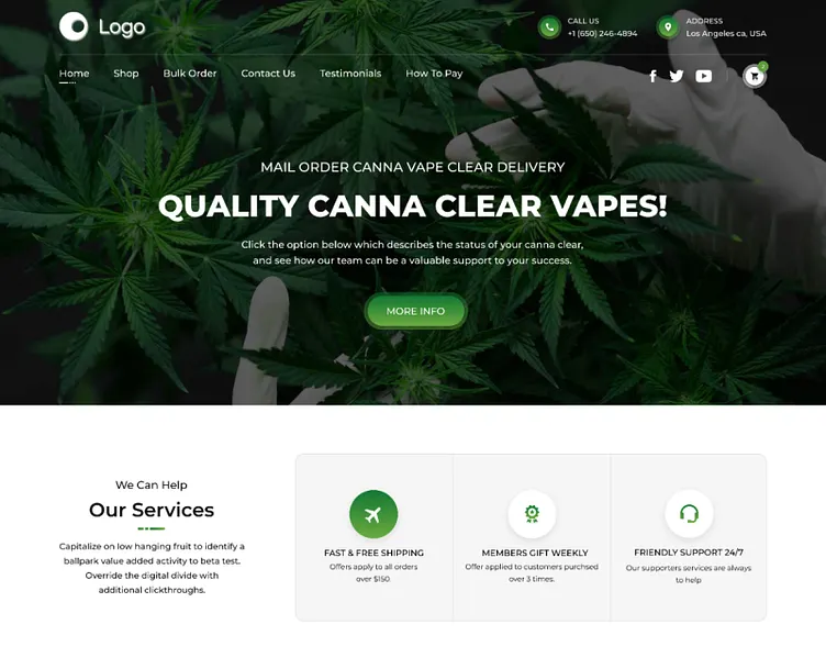
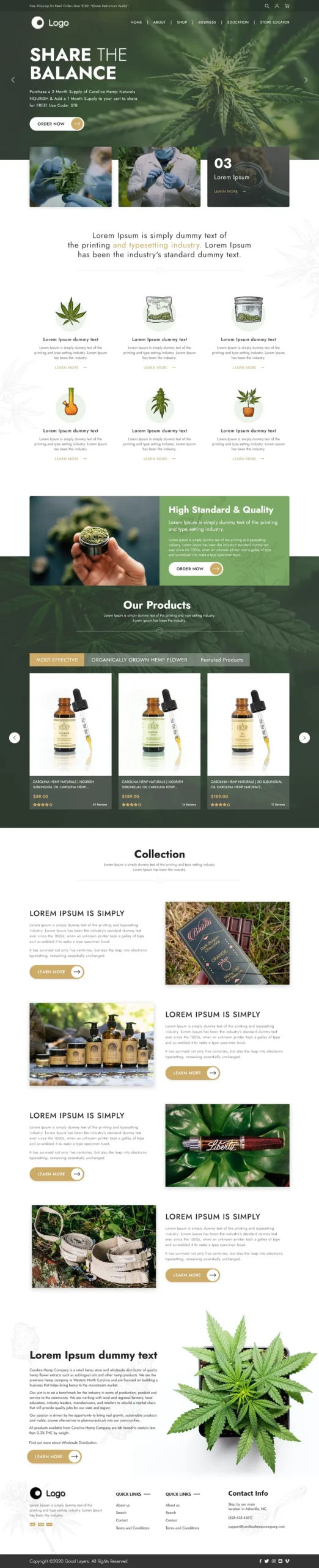
The client wanted a bold, brand-forward UI/UX design with a clean dark theme and minimal color palette—focused on product highlights, clear credibility/trust cues, and a smooth landing-page journey that drives users toward a primary action (shop / join waitlist / verify / contact).
Get a 48-hour UI Audit for your landing page
We’ll share a 10-point checklist + quick wins for hero clarity, trust cues, product hierarchy, and CTA conversion.
We designed a brand ecommerce landing page UI/UX focused on bold visual identity and conversion—balancing a dark, premium theme with clean hierarchy and scannable content. The layout emphasizes product highlights, key benefits, and credibility sections that build confidence quickly. Clear CTAs are placed at decision points (hero, mid-page, final section) to guide users toward the primary action without distraction. The design is mobile-first and component-driven, making it easy to reuse across new product drops, campaigns, and landing-page variations
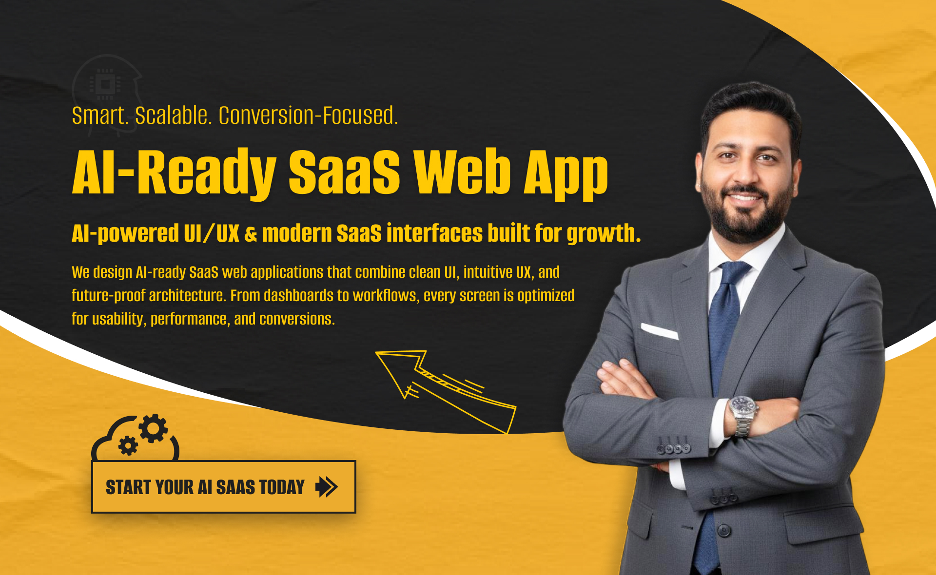
I will build an AI-ready, fast, modern, and scalable saas web app using React and NextJS
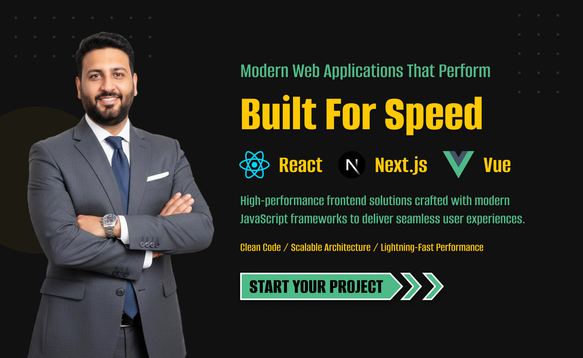
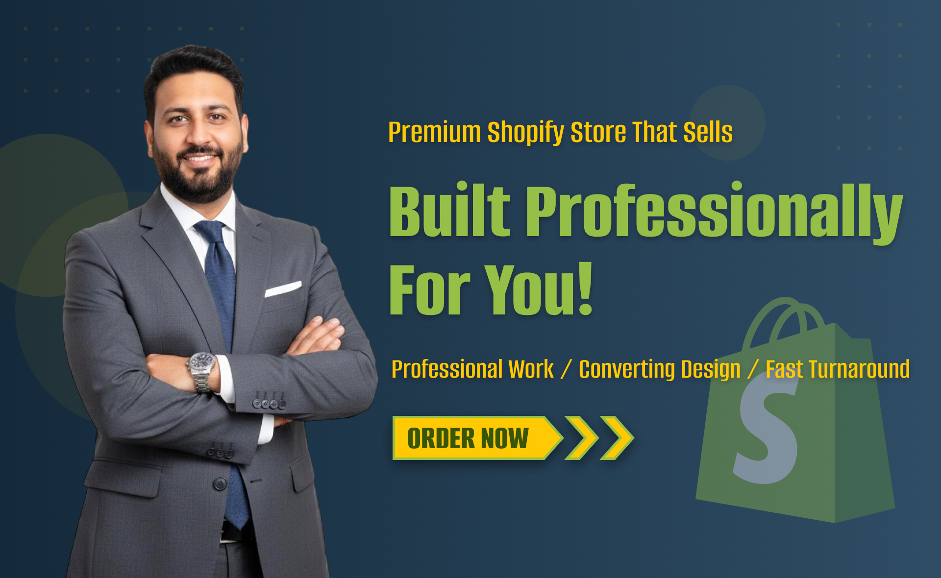
I will develop website with react next vue nuxt js tailwind CSS

I will design intuitive UI UX for dashboards crms web apps admin panels