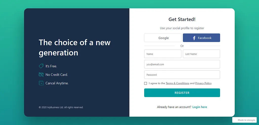
The client wanted a Gen Z–friendly registration page design that feels modern and fast—reducing drop-offs with clear form guidance, minimal friction, and a mobile-first layout that supports quick sign-ups.
Get a 48-hour UI Audit for your sign-up flow
We’ll share a 10-point checklist + quick wins for form UX, validation, trust cues, and reducing registration drop-offs.
We designed a registration page UI/UX focused on speed, clarity, and a modern Gen Z aesthetic—helping users sign up with fewer steps and less friction. The layout uses clean hierarchy, strong input states, and inline validation to prevent errors early. We also designed flexible sign-up options (email/phone and social sign-in patterns) while keeping privacy cues and trust elements visible. The result is a mobile-first onboarding experience that improves completion rates and sets the tone for the rest of the product.
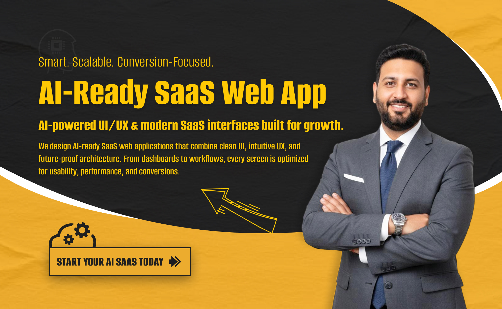
I will build an AI-ready, fast, modern, and scalable saas web app using React and NextJS
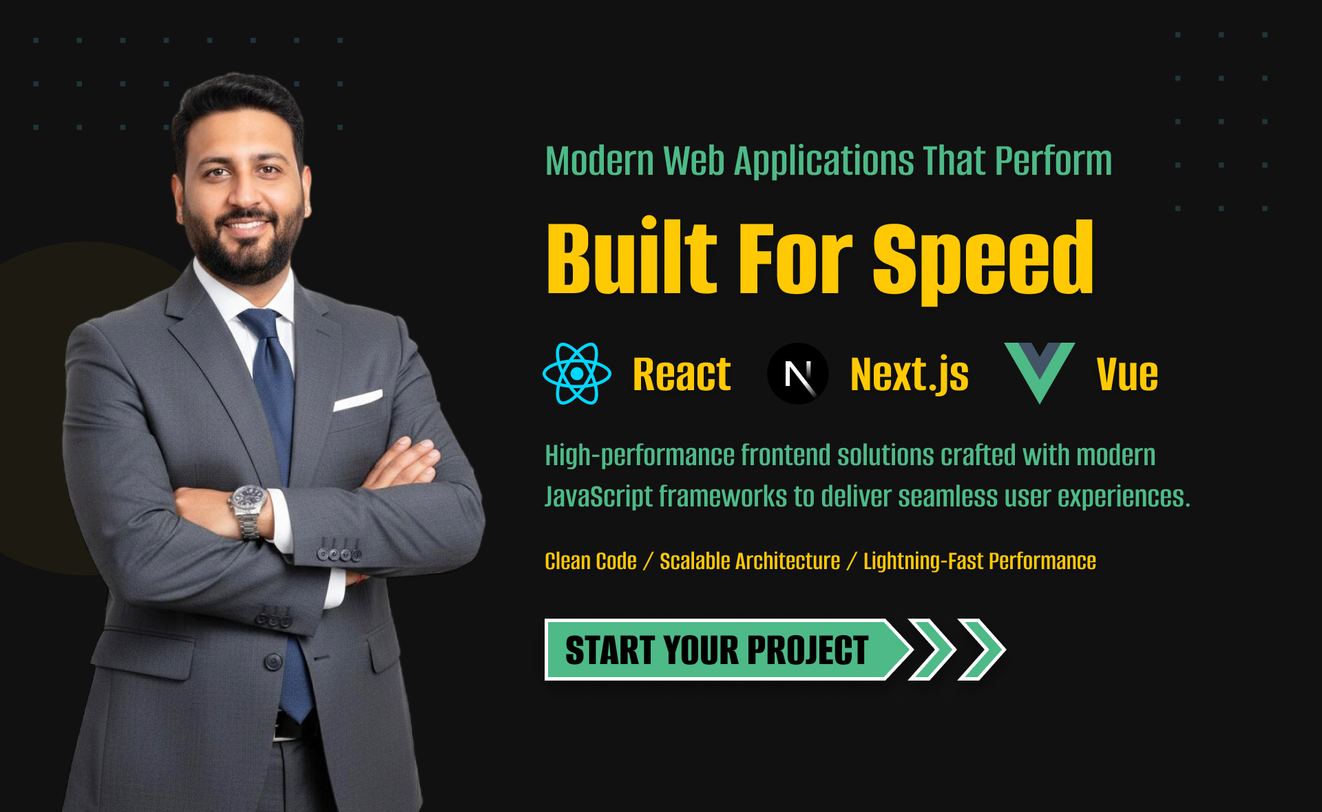
I will develop website with react next vue nuxt js tailwind CSS

I will design intuitive UI UX for dashboards crms web apps admin panels