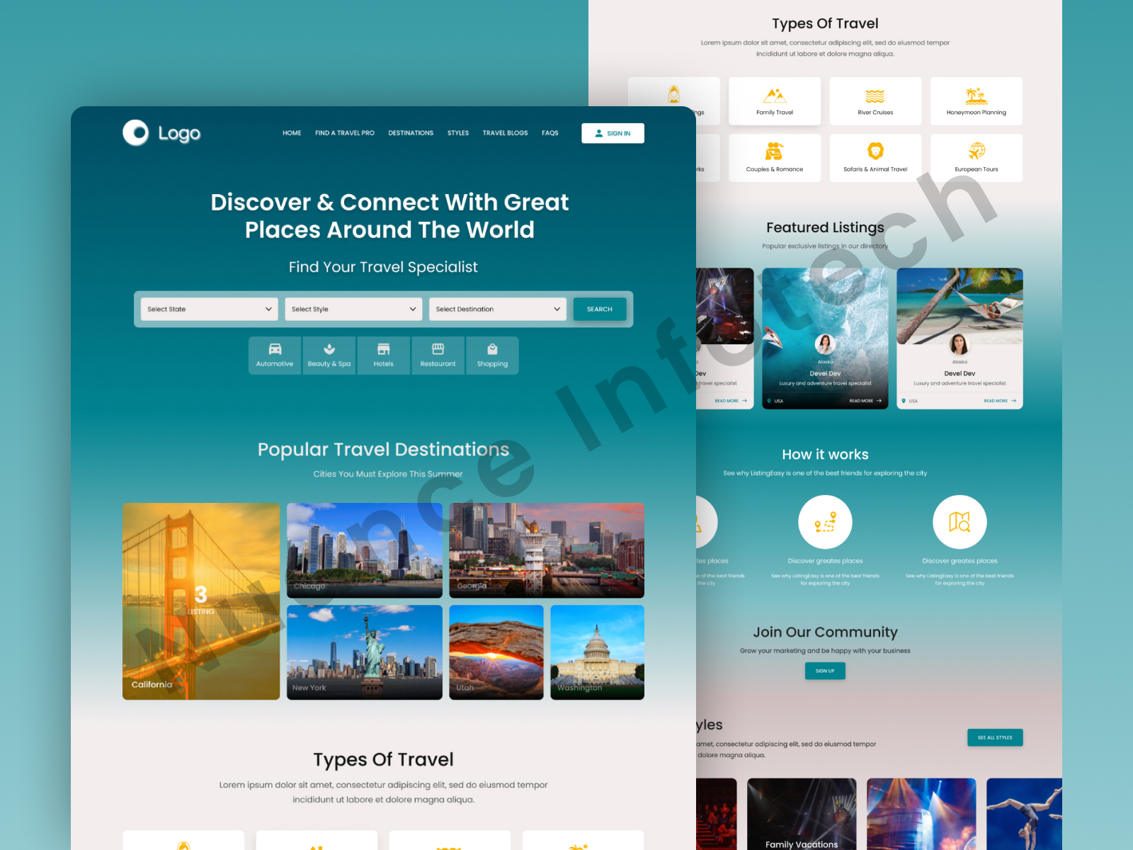
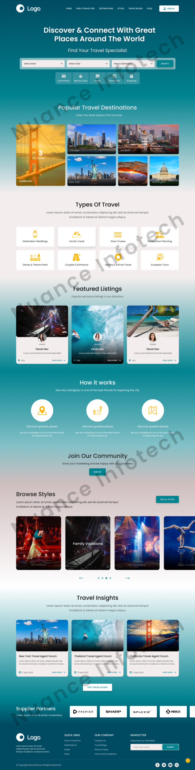
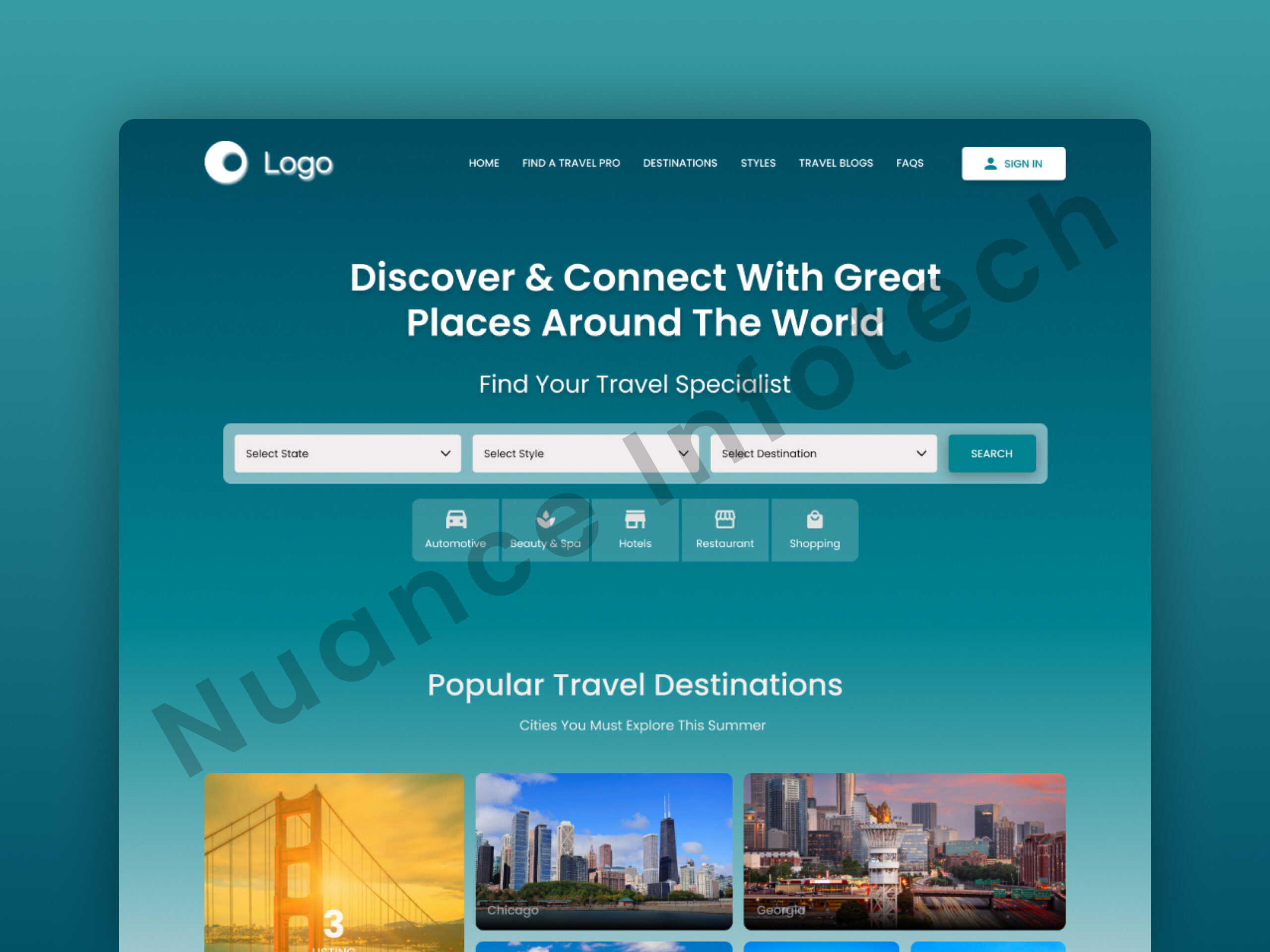
The client wanted a travel homepage design that helps users quickly explore destinations, discover curated packages, and connect with travel specialists—using a clean, image-led layout with strong filters and clear CTAs optimized for inquiries.
Get a 48-hour UI Audit for your travel homepage
We’ll share a 10-point checklist + quick wins for discovery UX, filters, trust cues, and homepage-to-inquiry conversion.
We designed a travel website homepage UI/UX focused on discovery and conversion—helping visitors explore destinations, view curated packages, and connect with the right travel specialist in a few steps. The layout uses strong visual storytelling with clean hierarchy: destination tiles, package highlights, and a search/filter pattern that reduces browsing friction. Trust cues and clear CTAs guide users toward requesting a curated itinerary or starting a conversation, while a mobile-first structure keeps the experience fast and intuitive across devices. The design is modular and scalable for adding new destinations, content, and campaigns.
I will build an AI-ready, fast, modern, and scalable saas web app using React and NextJS

I will develop website with react next vue nuxt js tailwind CSS

I will design intuitive UI UX for dashboards crms web apps admin panels