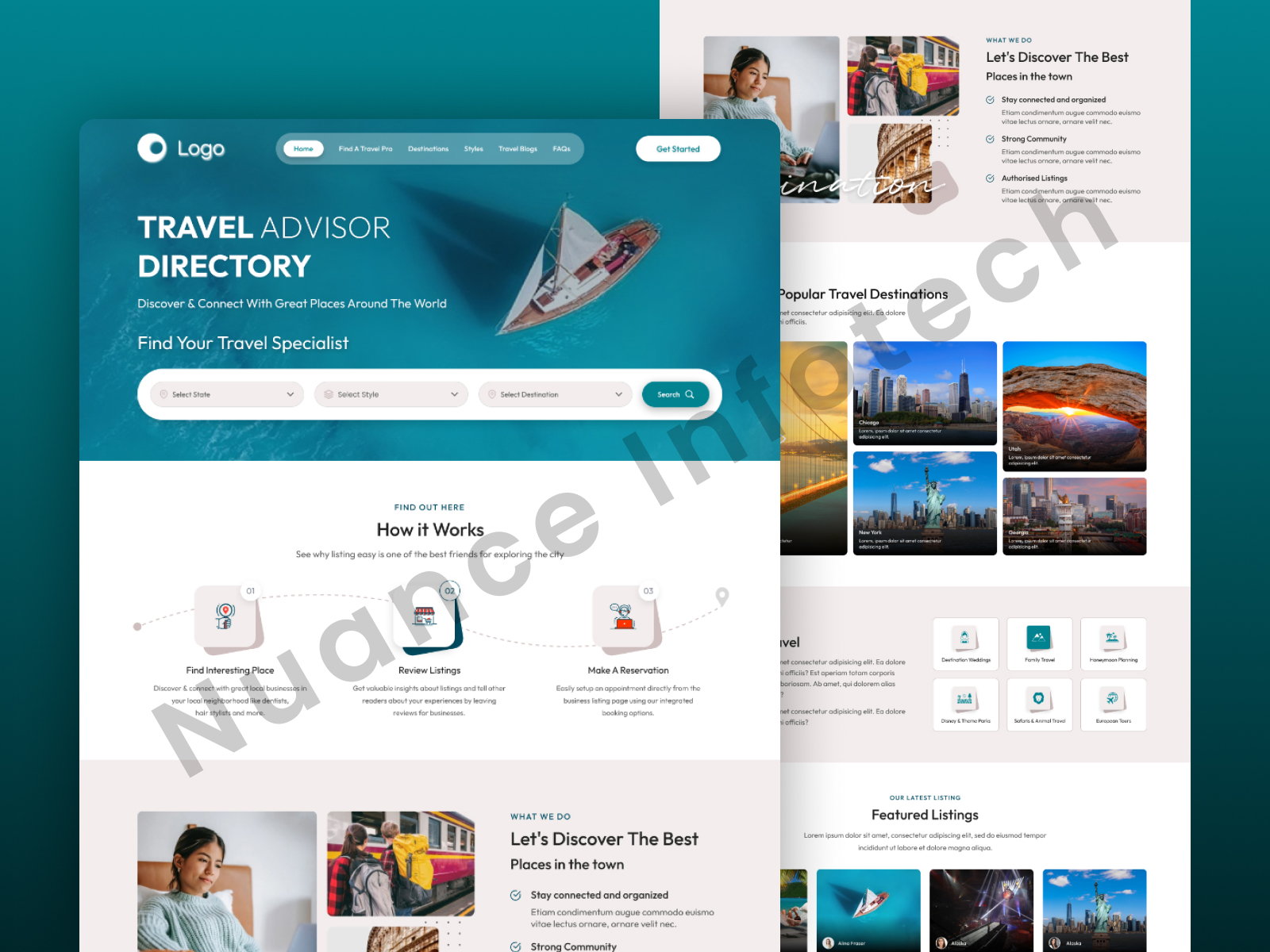
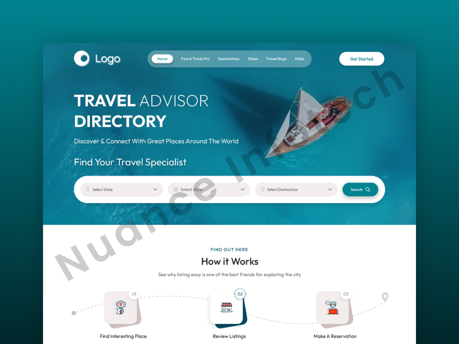
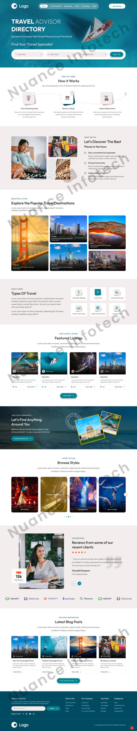
The client wanted a travel website landing page that helps users explore destinations quickly, understand packages at a glance, and convert into inquiries—using strong visuals, clean hierarchy, and clear CTAs optimized for mobile-first traffic.
Get a 48-hour UI Audit for your travel landing page
We’ll share a 10-point checklist + quick wins for discovery UX, trust cues, CTA placement, and inquiry conversion.
We designed a travel landing page UI/UX focused on discovery and lead generation—guiding visitors from inspiration to action through a clean, scroll-friendly flow. The layout balances aspirational imagery with structured content: destination highlights, curated package sections, and quick search/filter patterns that reduce browsing friction. Trust cues and clear CTAs help users request a curated itinerary or connect with a travel specialist, while a mobile-first hierarchy keeps the experience fast and intuitive across devices. The design is modular and scalable for adding new destinations, seasonal campaigns, and content over time.
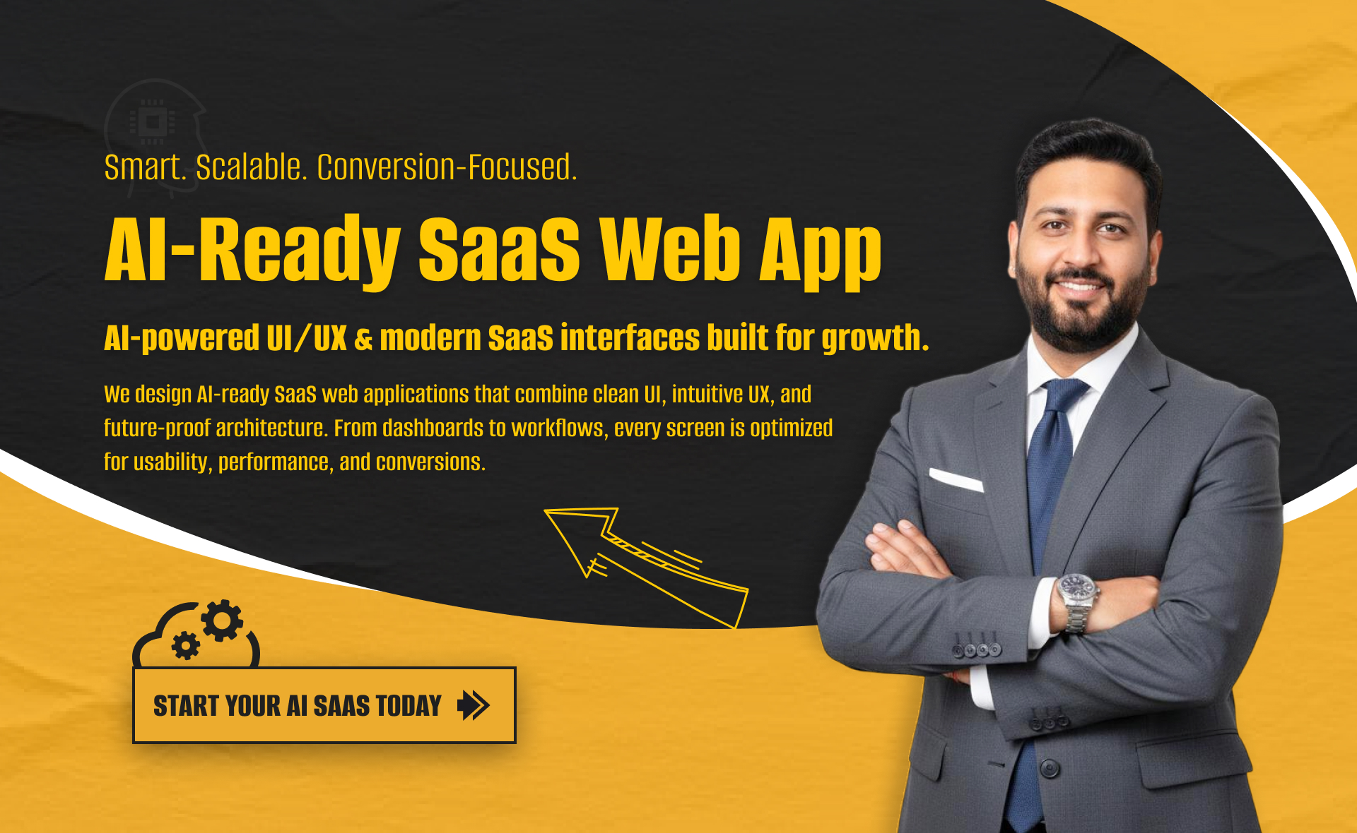
I will build an AI-ready, fast, modern, and scalable saas web app using React and NextJS

I will develop website with react next vue nuxt js tailwind CSS

I will design intuitive UI UX for dashboards crms web apps admin panels