The client wanted a bold, dark-theme product landing page that highlights product benefits quickly, showcases social content, and drives one primary action (Shop Now / Join Waitlist / Learn More). The page needed clean hierarchy, minimal distractions, and a mobile-first layout for conversion.
Get a 48-hour UI Audit for your landing page
We’ll share a 10-point checklist + quick wins for hero clarity, product hierarchy, trust cues, and CTA conversion.
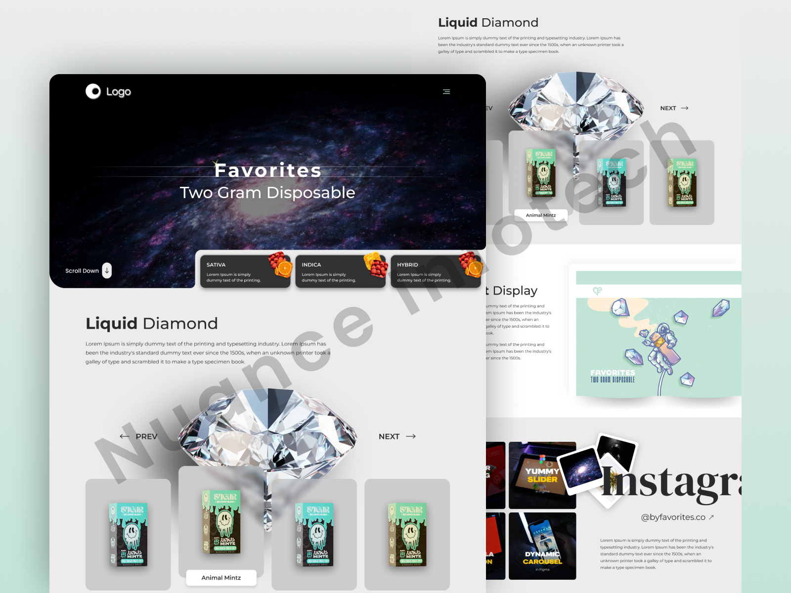
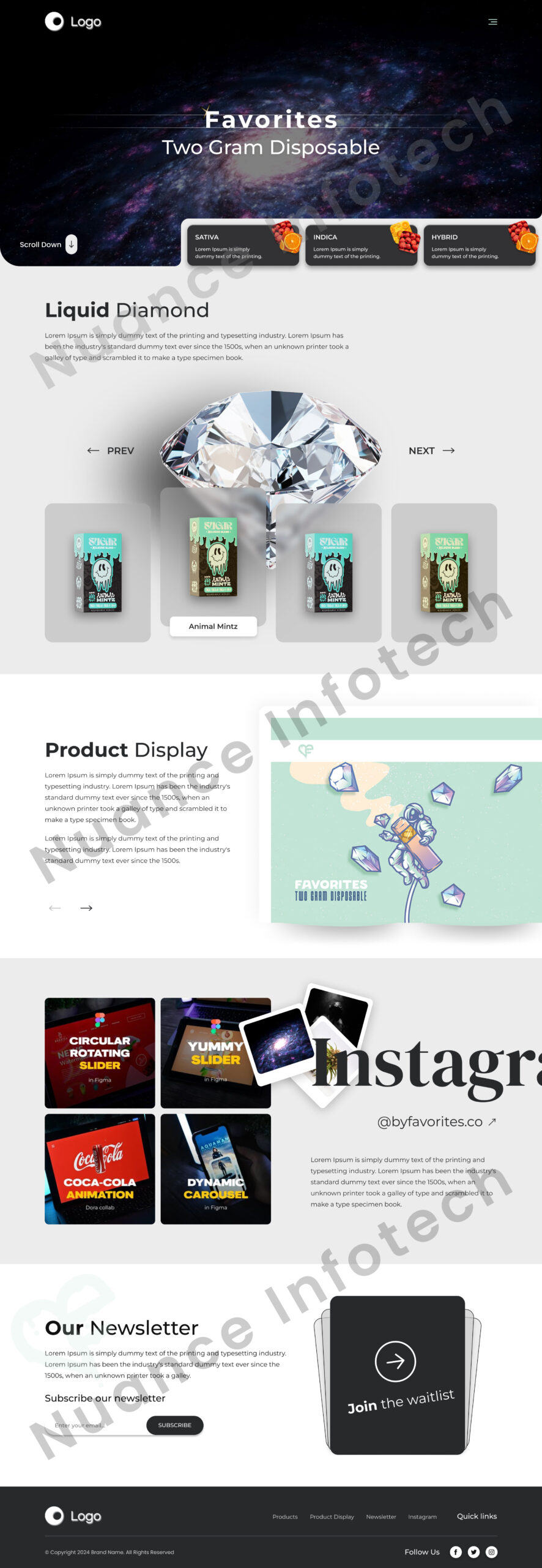
We designed a product landing page UI/UX focused on clarity and conversions—balancing bold dark-theme visuals with a clean, scroll-friendly structure. The layout prioritizes a strong hero section, product highlight blocks, benefit-led content, and credibility sections that reduce hesitation. Social proof modules (community/Instagram-style sections) and a waitlist capture pattern support pre-launch or drop-based marketing. Clear CTAs are repeated at decision points (hero, mid-page, final section) so users always know the next step. The design is mobile-first and modular, making it easy to iterate for campaigns, new drops, and A/B testing.
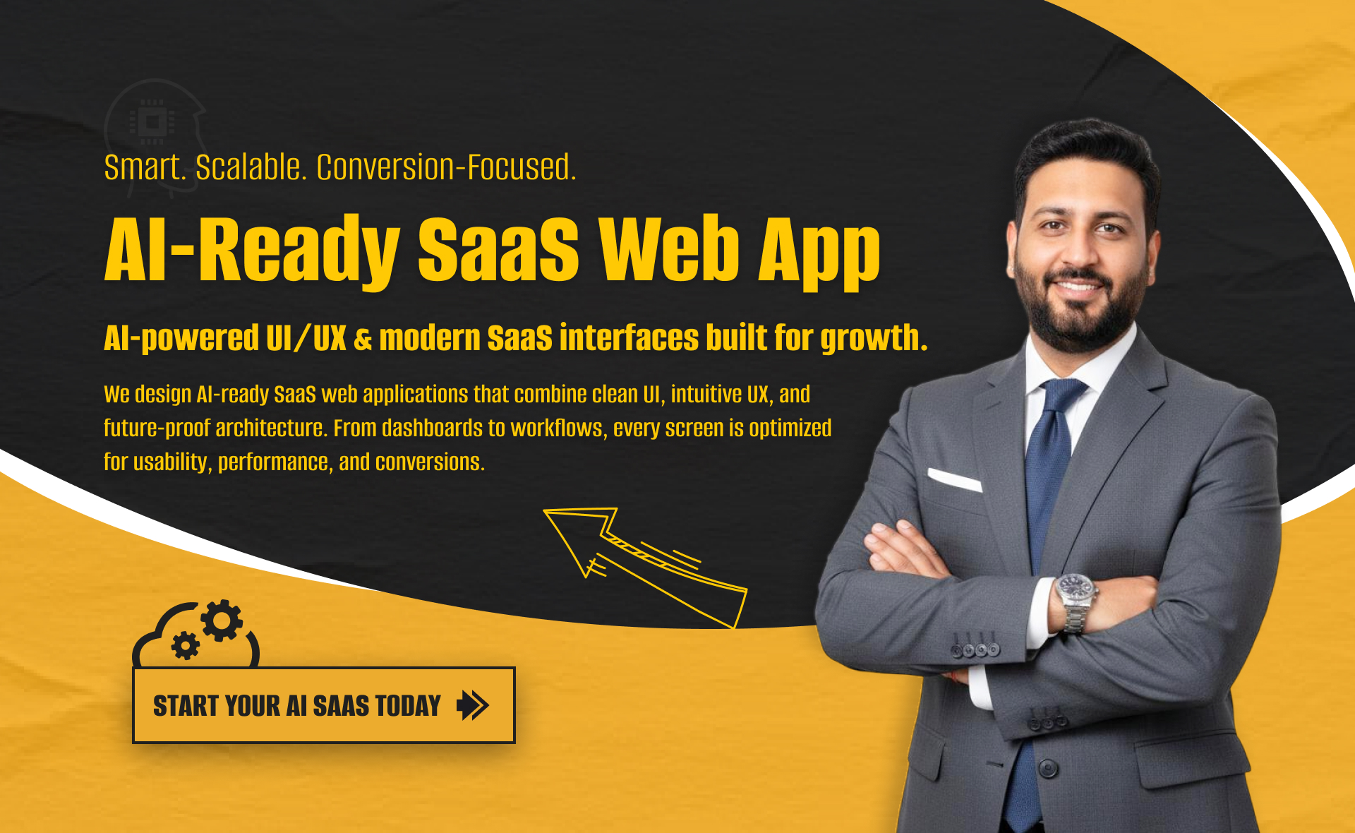
I will build an AI-ready, fast, modern, and scalable saas web app using React and NextJS
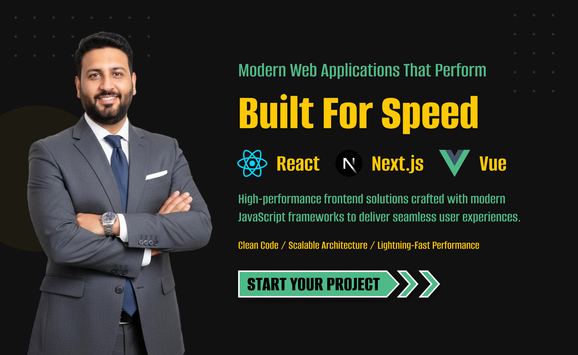
I will develop website with react next vue nuxt js tailwind CSS

I will design intuitive UI UX for dashboards crms web apps admin panels