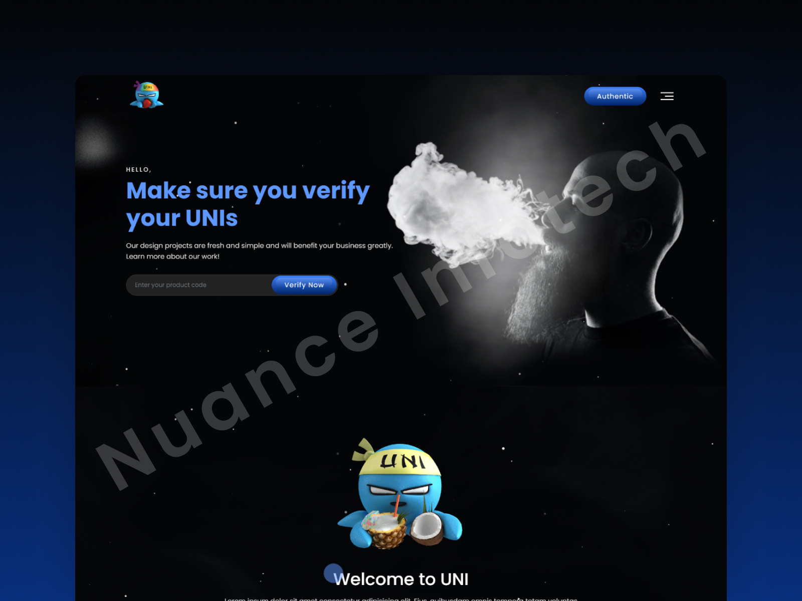
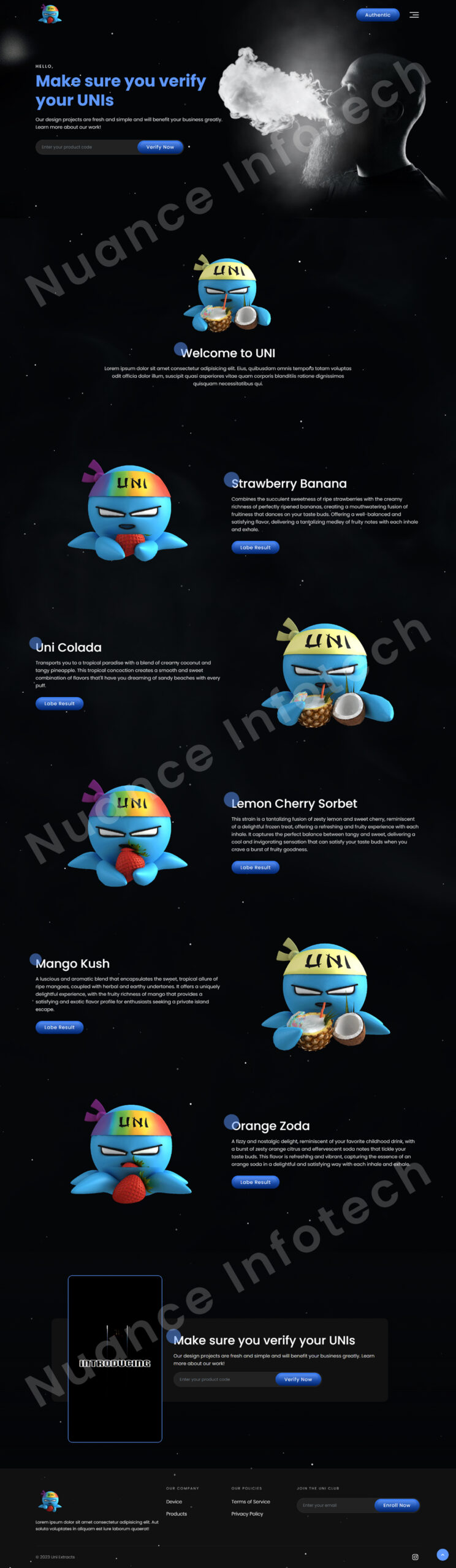
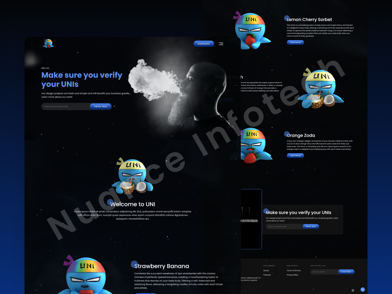
The client wanted a dark-theme verification landing page that feels premium and trustworthy—users should verify authenticity in seconds (QR/code/serial), instantly understand the result, and take the next step (view details / learn more / report issue) without friction, especially on mobile.
Get a 48-hour UI Audit for your verification flow
We’ll share a 10-point checklist + quick wins for input UX, trust cues, success/error states, and drop-off reduction.
We designed a dark verification landing page UI/UX focused on trust, clarity, and speed—combining premium visuals with a clean, structured verification journey. The layout prioritizes clear input guidance for QR/code/serial verification, instantly readable states (verified / not verified / error), and supportive microcopy that explains what the result means. Trust cues and supporting sections like “how verification works,” FAQs, and a report/support action path help users feel confident and informed. The design is mobile-first and modular, making it easy to scale across product lines and campaigns.
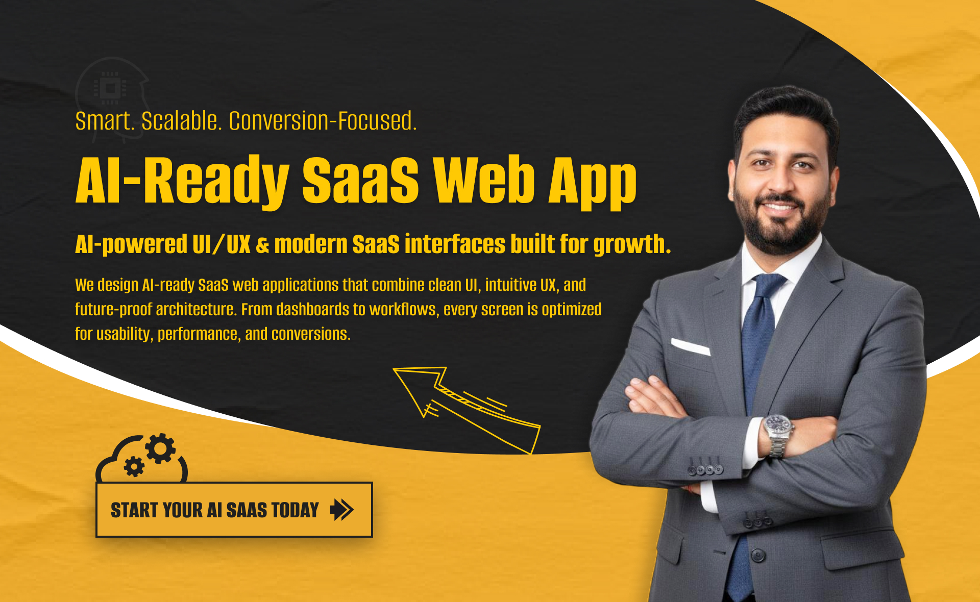
I will build an AI-ready, fast, modern, and scalable saas web app using React and NextJS
I will develop website with react next vue nuxt js tailwind CSS

I will design intuitive UI UX for dashboards crms web apps admin panels