
Fun & Colorful Product Verification Landing Page
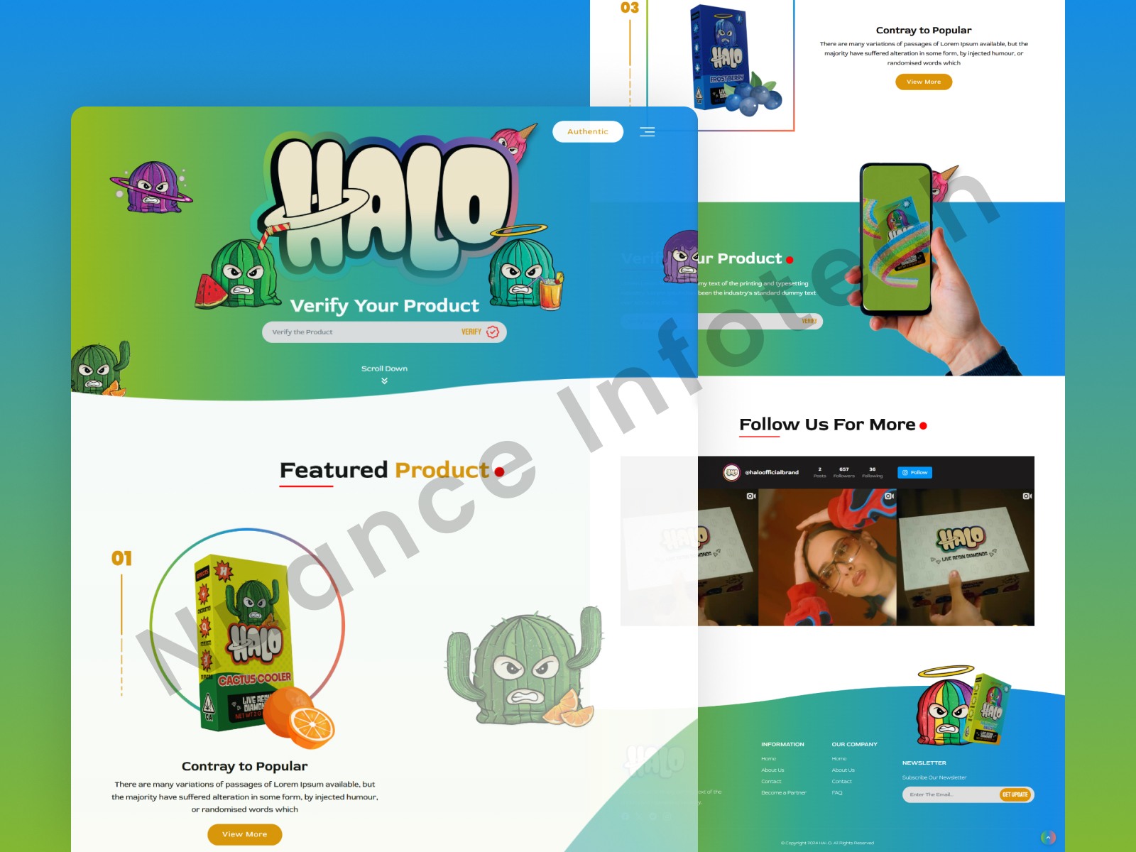
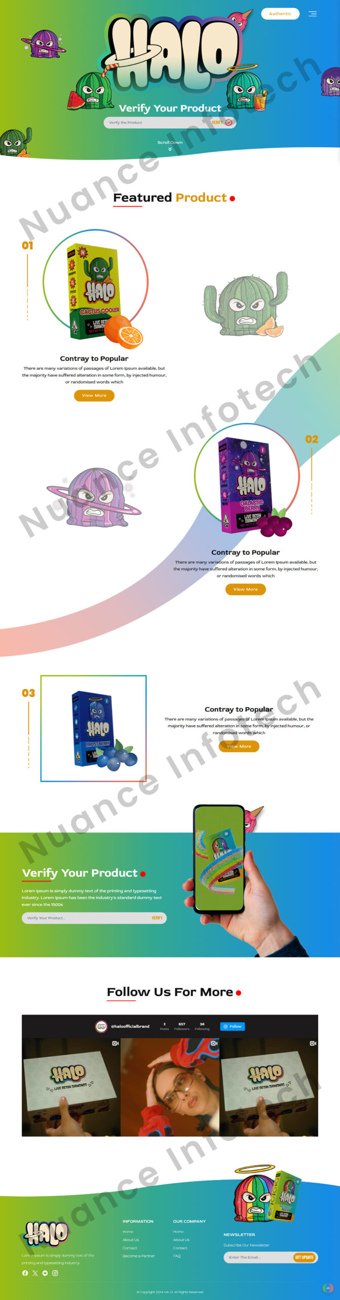
The client wanted a fun, colorful product verification landing page that feels friendly and energetic while still building trust—users should be able to verify authenticity in seconds (QR/code/serial), understand the result instantly, and know the next step without confusion.
01The approach
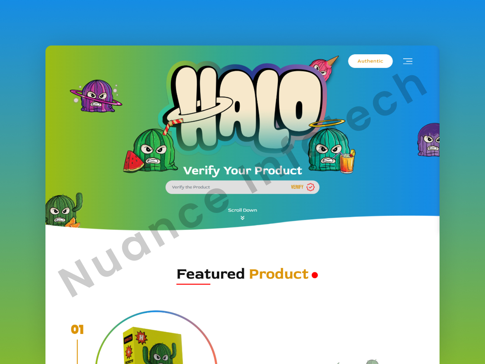
We designed a colorful product verification landing page UI/UX that combines playful visuals with a trust-first verification flow. Users can verify authenticity through a simple QR/code/serial entry, with instantly clear states (verified / not verified / error) and guidance that keeps the journey frictionless. The layout uses bold illustration-friendly sections, clean hierarchy, and repeated CTAs so users always know what to do next—verify, learn how it works, or contact support. Built mobile-first with reusable components, the design can scale across product lines, campaigns, and seasonal drops.
Prefer a marketplace?
Hire the same team on Fiverr.

I will build an AI-ready, fast, modern, and scalable saas web app using React and NextJS

I will develop website with react next vue nuxt js tailwind CSS

I will design intuitive UI UX for dashboards crms web apps admin panels
I will design and develop a shopify website with full store setup
More designs
Start a conversation
Discuss a similar project.
Send a link or a few screenshots. A senior designer replies with a suggested first step, usually a 48-hour UI audit with a 10-point checklist and quick wins.
- NDA before you share a brief, a repo or a client name
- Your first call is with a senior engineer, not a salesperson
- A realistic plan and an honest cost range, whether or not you build with us
Tell us about it
NDA on requestOne workflow is enough. We’ll reply with what a first step looks like.